Enrich part 2. Restyling
Like I said in Part 1, we weren’t going for a full overhaul of the enrichment software, just a restyle. I wasn’t totally on board with that. To me, it felt like going for the quick win instead of investing in something bigger, something that would actually last. But yes, some parts of the software did need urgent care, so if we pulled this off right, maybe we could still make it worth the effort. Even if it meant settling for less than I thought we should.
From the old to the new
The old design for reference.
Overview page
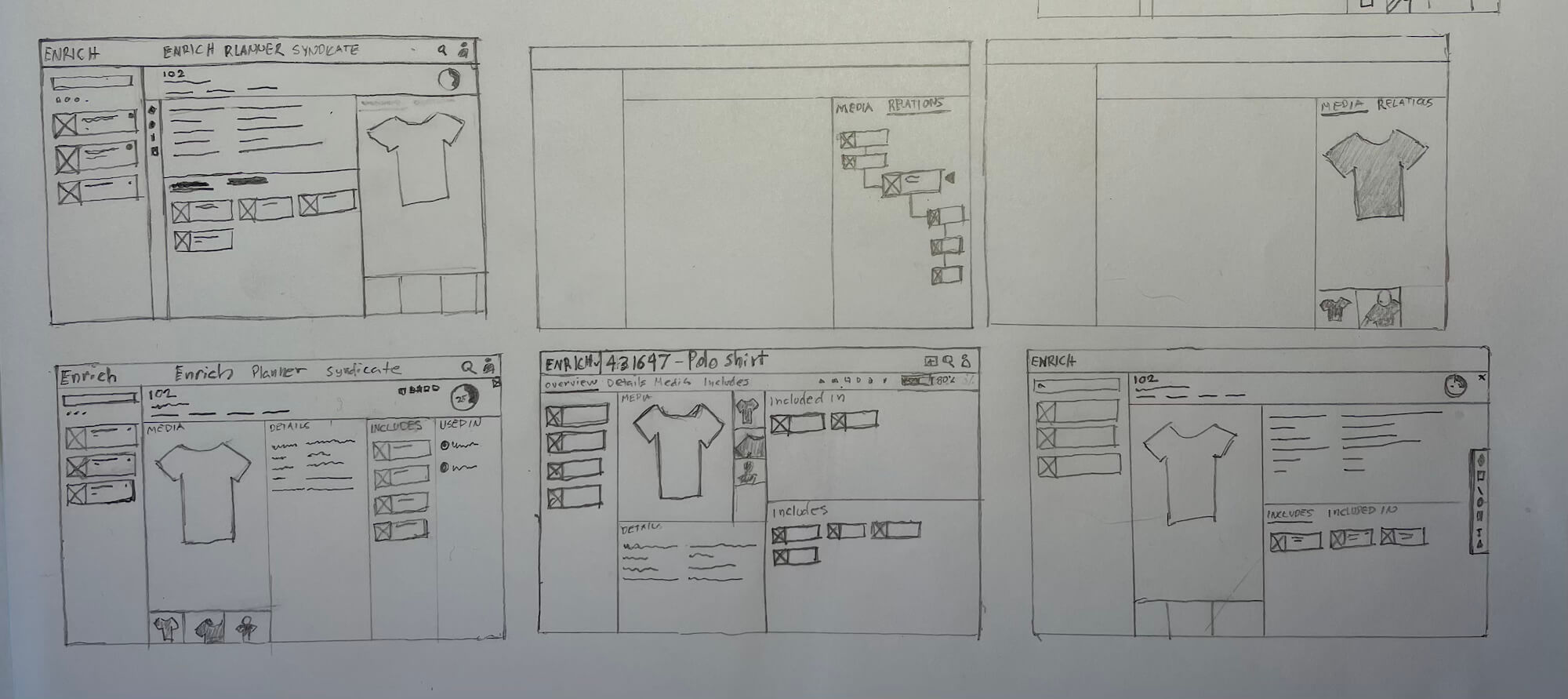
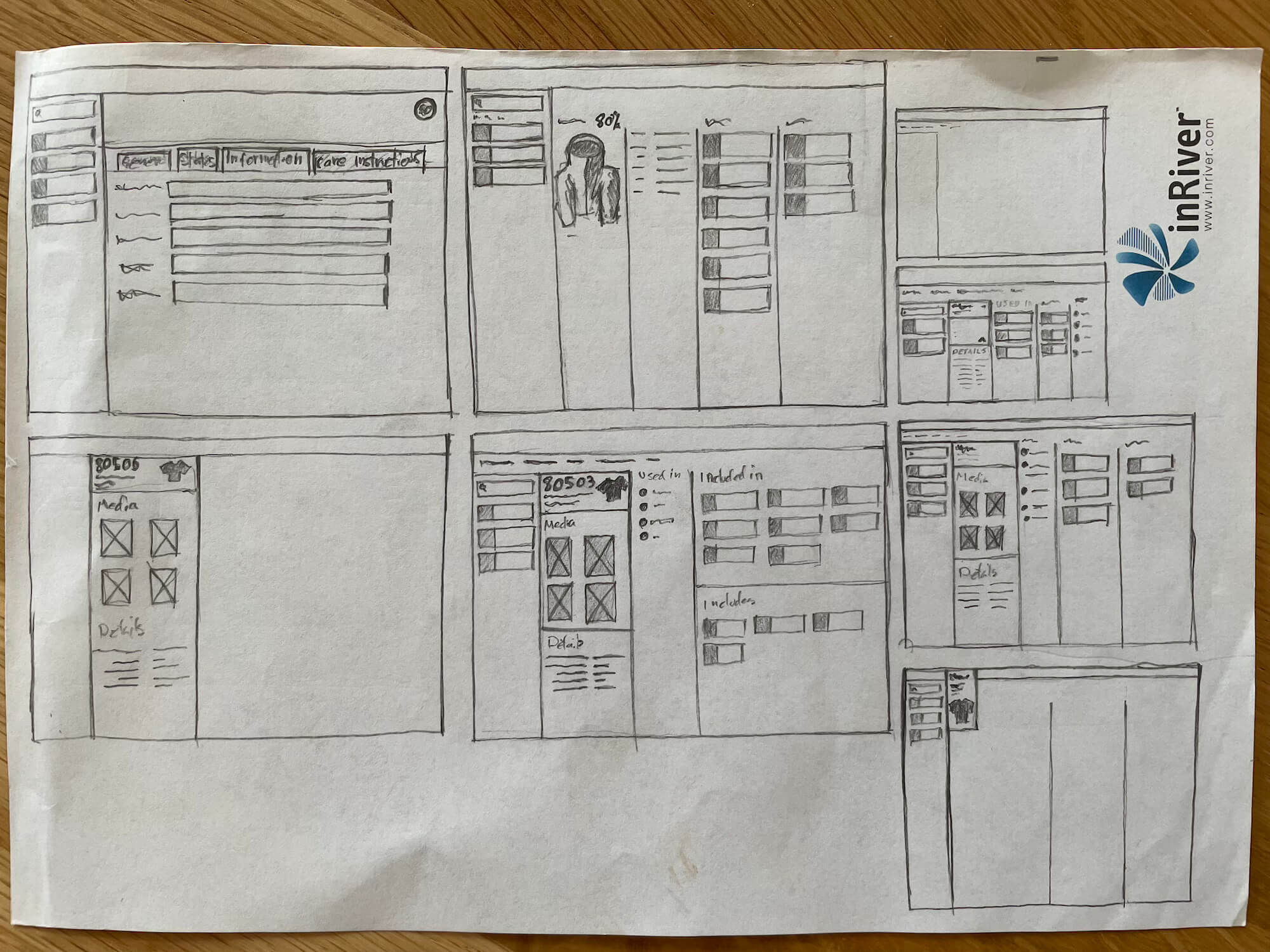
I had a few core ideas i wanted to sketch out for this page. A Large product image somewhere on the screen, tighten the vertical real estate to get more room for content and move the various menus to more logical places.
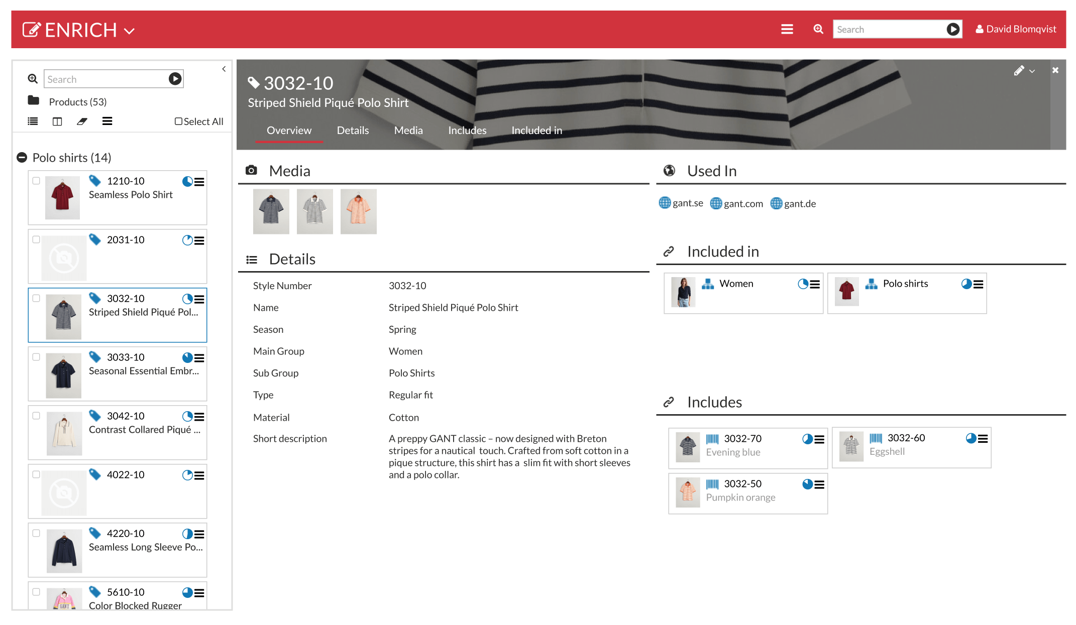
The new Overview page design
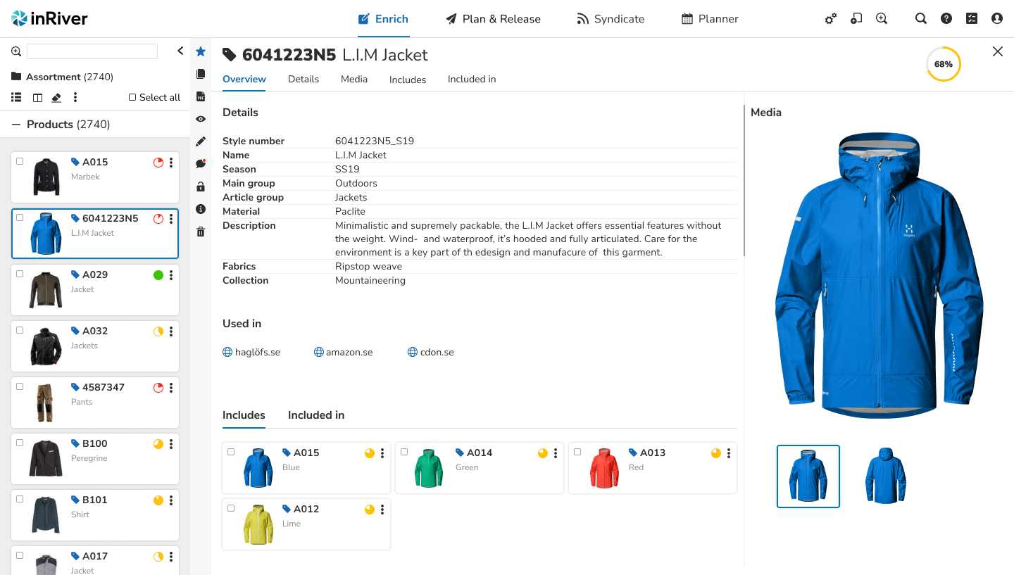
The finished layout of the Overview page.
- Menu for the applications moved out onto the header for easy access
- The entity header is compressed and the image is now gone
- Big product image
- Includes and included in is now under a tabbed menu
- Toolbar is moved over here to free up vertical space
- The product cards are cleaned up a bit, now with color coded completeness symbols for quicker recognition of their completeness status
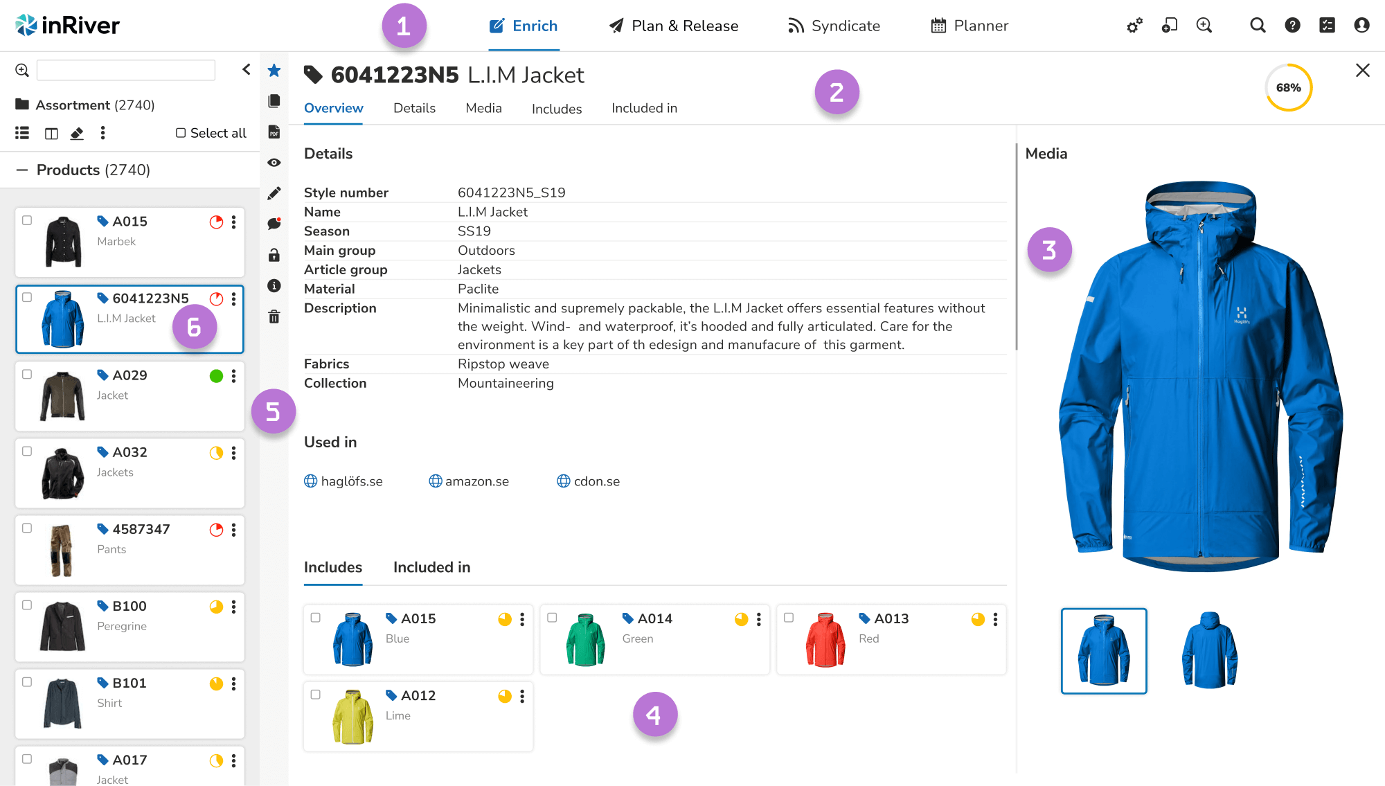
Details page
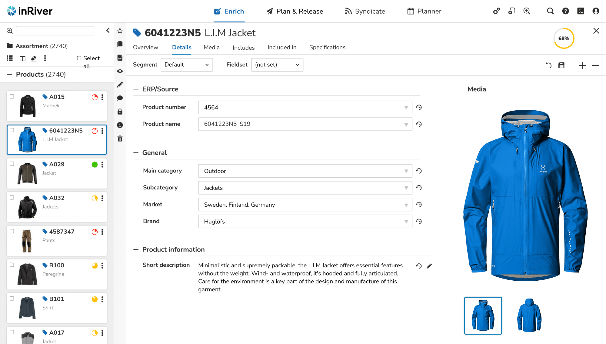
The Details page is where most of a products information is added. Persons enriching had long wished to view a large image of the product while filling in all the details and therefore the large image stays in place here, just like on the Overview.
Conclusion
This “restyling” project turned out to be more challenging than expected even though the goal was to make it easier than a full redesign. The original CSS was extremely unstructured, which made implementation time consuming and required constant back and forth between me and the frontend developers.
We had to find compromises to bring the new design to life without breaking the existing application. Despite these constraints, the restyled apps received positive feedback from users, especially around visual clarity and better consistency.
That said, some users felt the changes were not enough and expressed a desire for a more comprehensive overhaul — which in many ways aligned with what I also saw as the next logical step. Even though the result wasn’t a full redesign, the project laid the groundwork for future improvements and showed that even small changes can make a difference.